
Data-Driven Energy Analysis
How the world's energy systems actually work
Analysis of power grids, data center energy, and renewable infrastructure. No spin, just data.
View latest analysis
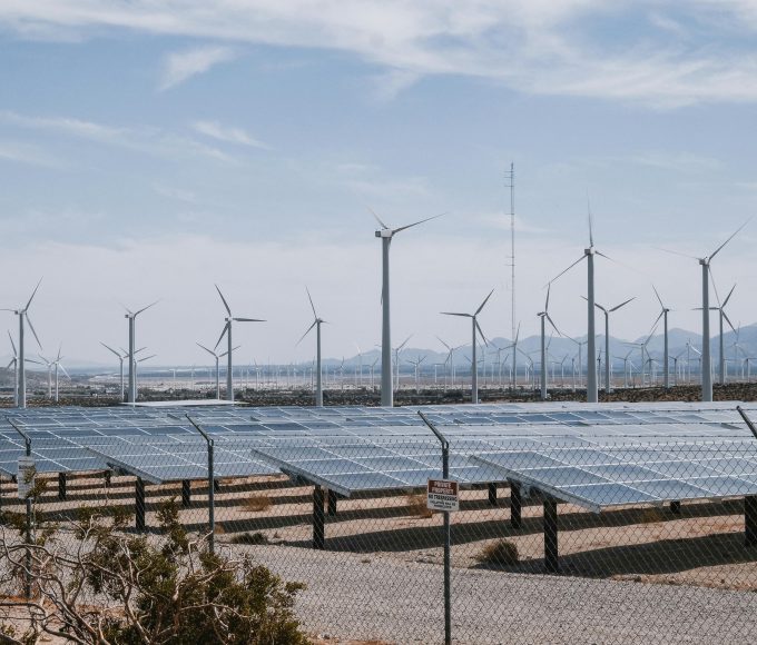
Data-Driven Energy Analysis
Analysis of power grids, data center energy, and renewable infrastructure. No spin, just data.
View latest analysis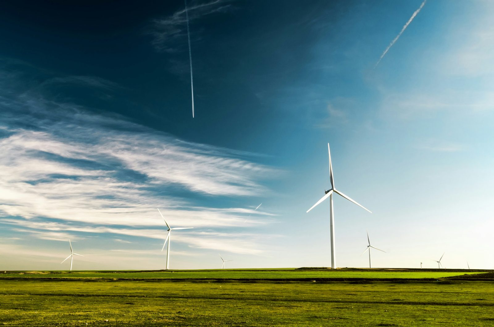
The duck curve is a graph of net electricity demand over the course of a day that reveals a distinctive shape resembling the profile of a duck. Net demand is the total electricity demand minus the output of variable renewable generators, primarily solar. During midday hours, when solar generation peaks, net demand drops sharply, forming the belly of the duck. In the late afternoon and evening, as solar output declines and people return home and turn on lights, appliances, and air conditioning, net demand ramps up steeply, forming the neck and head of the duck.
The California Independent System Operator first published the duck curve in 2013, and it has since become one of the most widely referenced concepts in energy. The phenomenon has intensified dramatically as solar capacity has grown. In California, net demand during spring midday hours can now drop by more than 15 gigawatts below morning levels, only to ramp up by 18 gigawatts or more in the span of three to four hours as the sun sets.
The duck curve creates two distinct operational challenges for grid operators. The first is the midday trough. When net demand drops to very low levels, conventional generators must ramp down or shut off. Many thermal power plants, particularly nuclear and large coal units, cannot reduce output quickly or economically. If more solar energy is produced than the grid can absorb, curtailment becomes necessary, wasting clean energy that has already been generated.
The second challenge is the evening ramp. As solar output falls, grid operators must bring online enough generation to cover both the loss of solar output and the natural increase in evening demand. This ramp rate, the speed at which net demand increases, has become the steepest and fastest in grid history. Dispatchable generators must be ready to increase output rapidly, and any shortfall risks grid instability or emergency measures.
While California pioneered the duck curve, it is now appearing in every region with significant solar penetration. Texas sees midday wholesale prices drop to zero or negative levels during sunny spring days. Australia’s grid experiences a version of the duck curve that has deepened rapidly with rooftop solar adoption. Hawaii, with the highest per-capita solar installation rate in the United States, has dealt with duck curve challenges for years.
The shape and severity of the duck curve vary by season and region. It is most pronounced in spring, when solar output is strong but air conditioning demand has not yet ramped up. Summer heat flattens the curve somewhat because cooling loads are high even during midday hours.
Battery energy storage is the most direct solution to the duck curve. Batteries charge during the midday solar surplus and discharge during the evening ramp, smoothing the net demand profile. California has deployed gigawatts of battery storage specifically to address this pattern, and batteries now contribute several gigawatts of power during the evening peak.
Demand-side solutions also help. Time-of-use electricity rates encourage customers to shift consumption to midday hours when solar is abundant. Electric vehicle charging during work hours absorbs midday generation. Industrial processes that can flex their electricity consumption, such as water desalination and hydrogen production, can be scheduled to run when solar output is highest.
As solar capacity continues to grow, the duck curve is deepening. Some analysts now refer to the canyon curve, reflecting the increasingly extreme midday trough. Grid operators are adapting by investing in flexible resources, redesigning rate structures, and developing new market products that compensate resources for the ability to ramp quickly. The duck curve is not a problem to be solved but a structural feature of high-solar grids that requires ongoing management and investment.
What Is Utility-Scale Solar? Utility-scale solar refers to large photovoltaic installations, typically...
The Physics of Photovoltaic Cells Solar panels generate electricity through the photovoltaic...
How Net Metering Works Net metering is a billing arrangement that allows...
What Is a Power Purchase Agreement? A power purchase agreement, or PPA,...


Leave a comment